Concept · The operating picture
CAMS is the spine of one control. It isn't the whole product.
It's easy to meet Performix through the CAMS team diagnostic and conclude that's all it is. CAMS is load-bearing — but it's the engine under one of three controls, not the building.
There are three ways to move the performance of a firm: change who comes in (Attraction), get more out of the people already here (Activation), and keep the ones you can't afford to lose (Attrition). Each is measured. And they roll up into a single number a busy executive can act on — the one that says, across all your teams, where the most detrimental gap is and where a dollar of attention pays back first.
01 · The frame
Three controls, each measured, rolling up to one number.
See the proofHide
01 · The frame
Three controls, each measured, rolling up to one number.
CAMS is the engine under Activation — the spine of one lever, not the whole product. The breadth is the point: three controls, each measured, rolling up to one number a leader can act on.
Attraction is the select-in door: are the right people coming in, and would the market consider, know, and pick you over rivals? Activation is the develop-in-place door: are the people already here producing what they could? Attrition is the keep door: are you holding onto the people worth holding, and losing the right ones for the right reasons?
CAMS lives under Activation. It answers why capable people still don't perform — which of Capability, Alignment, Motivation, or Support is the binding constraint right now. It's the spine of one lever, and it's deliberately not asked to carry the other two.
What makes this an operating picture and not three disconnected reports is the rollup: Activation translates into value, and value is what ranks the levers against each other and across teams.
02 · The one number
Net Activated Value — where to invest, ranked across every team.
See the proofHide
02 · The one number
Net Activated Value — where to invest, ranked across every team.
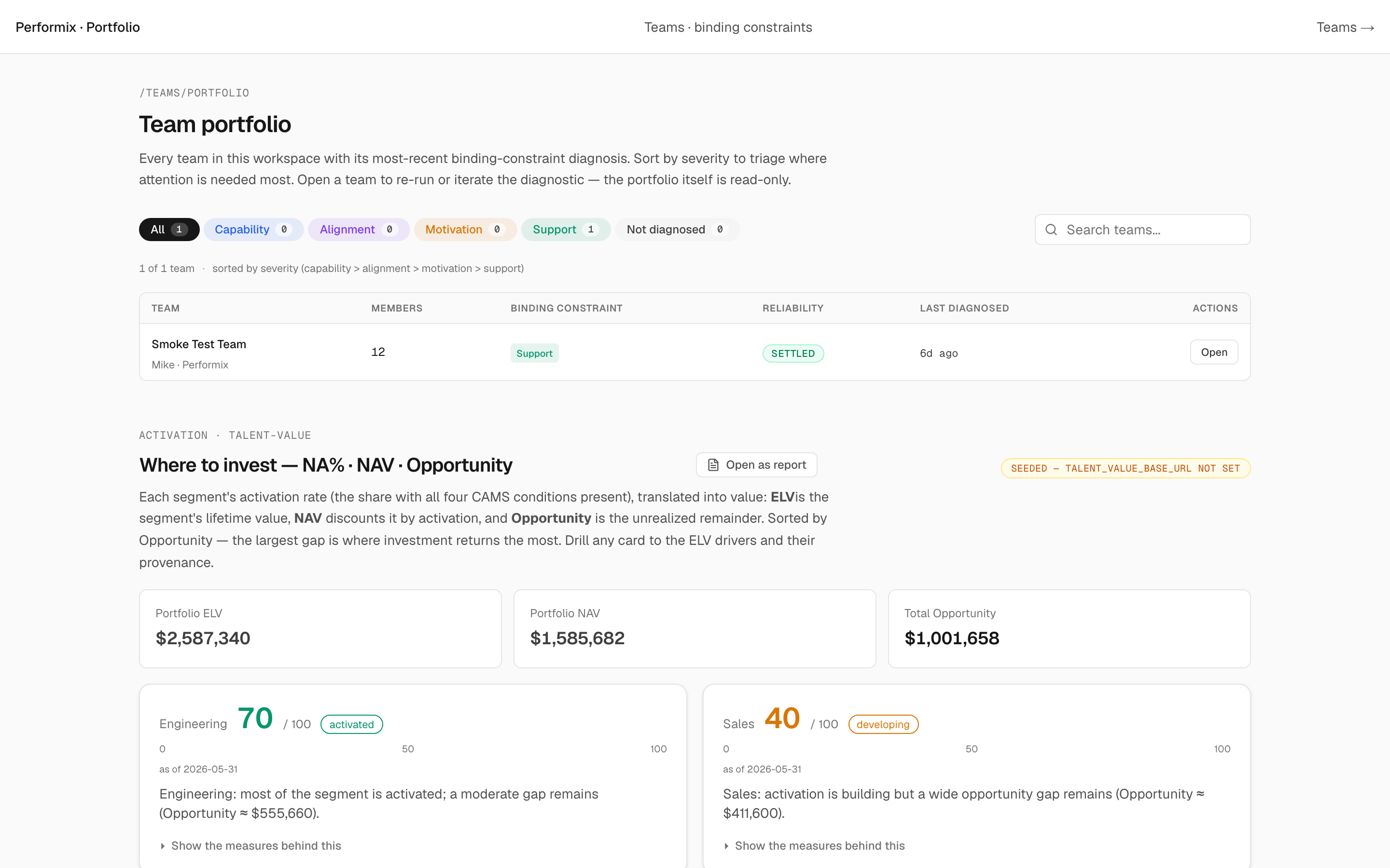
A capability score of “72 out of 100” doesn't move a budget. “$556K of value sitting unrealized in Engineering” does. The value stack converts an activation percentage into a number a CFO can put next to Revenue and Headcount: ELV (what a role is worth over its tenure), Net Activated % (the share actually being realized), NAV (the dollars captured), and Opportunity (the gap you invest against).
Rank the segments by Opportunity and you have the thing an executive of many teams actually needs — not twelve dashboards, one ordered list of where the most value is leaking. This is the view that had gone quiet, and it's the point of measuring activation in the first place.
03 · The assessment underneath
“Attract differentiated talent” is empty until you can say differentiated how.
See the proofHide
03 · The assessment underneath
“Attract differentiated talent” is empty until you can say differentiated how.
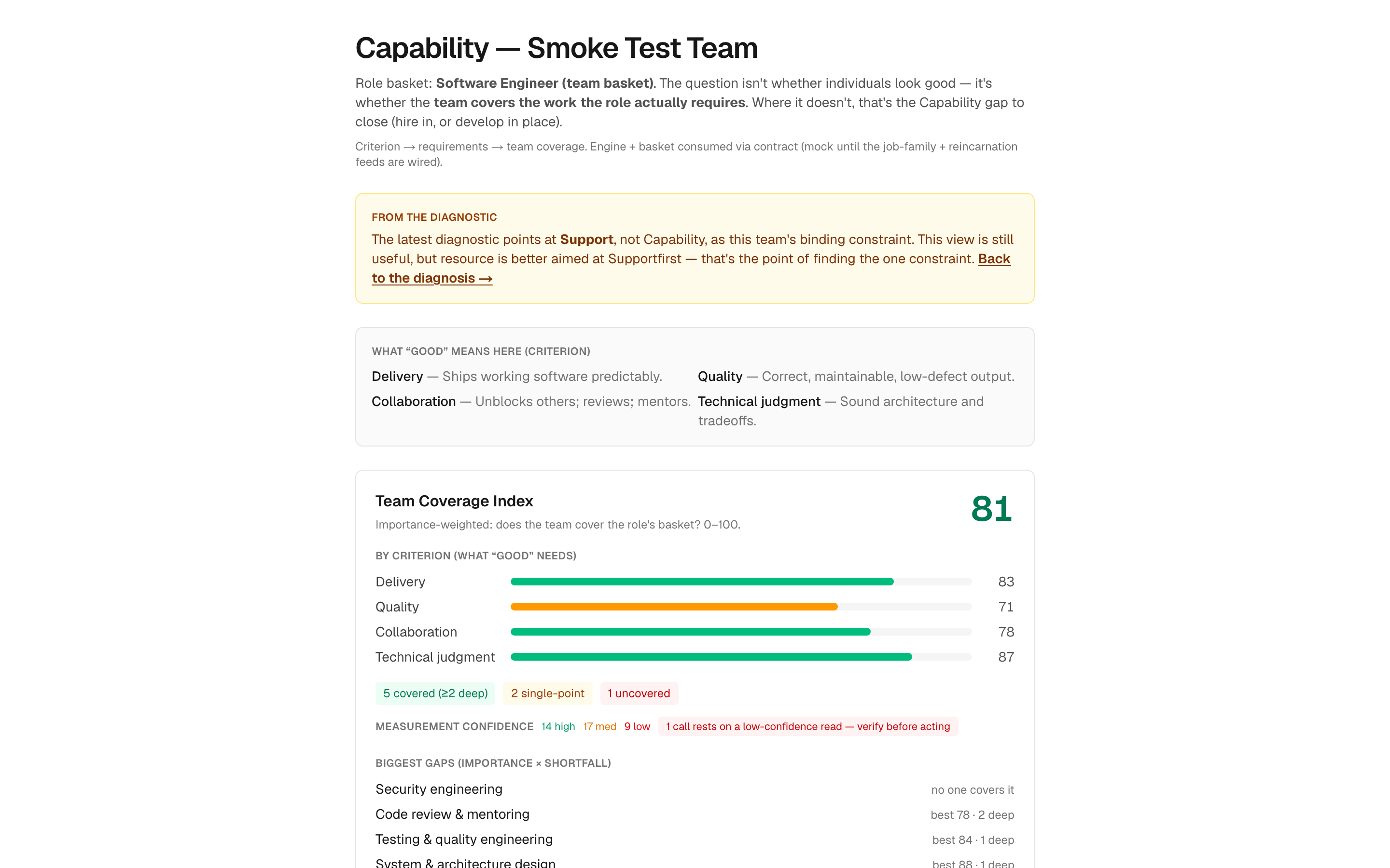
Everyone agrees you should hire and develop differentiated talent. The word does no work until you can answer the next question: differentiated on what, measured how? That's an assessment problem, and it's the one most organizations quietly skip because rigorous job analysis used to require an I-O psychologist on retainer.
Capability assessment makes it concrete. It starts from the role's actual requirements — a rubric of what “good” means — and asks whether the team covers the work, not whether individuals look good on paper. A team can post a high average and still leave a critical requirement uncovered or resting on a single person. That's the difference between a coverage view and a scorecard.
This is why the library matters as much as the algorithm: the rubric isn't invented per customer, it's drawn from what research already knows about the work.
04 · Universal and specific
One model, adapted to the nature of the work.
See the proofHide
04 · Universal and specific
One model, adapted to the nature of the work.
Triple-A and CAMS apply almost everywhere — that's what makes them a usable frame. But what “good” means is not the same for a surgical team, a sales floor, and a research group. A model that ignored that would be a horoscope; a tool that started from scratch for every customer would never ship.
Performix resolves this with its library. Before you arrive, the research substrate has already absorbed what's known about how performance varies by the nature of the work — a review and catalog of the prior research, turned into constructs, validated items, and evidence weights. The universal frame is the skeleton; the library is the specific muscle it grows for your kind of work.
Then the path adapts. The library, the ranking and value-of-information algorithms, and your situational survey responses together choose what to ask next and how deep to go — starting at a CAMS minimum and narrowing only where the answers and the value of knowing justify it. That's the deepest reason this isn't a BI dashboard: a dashboard shows the same cells to everyone, while this decides its own analytical path from what it already knows and what you've just told it.
05 · The other two doors
Attraction and Attrition, working — not slideware.
See the proofHide
05 · The other two doors
Attraction and Attrition, working — not slideware.
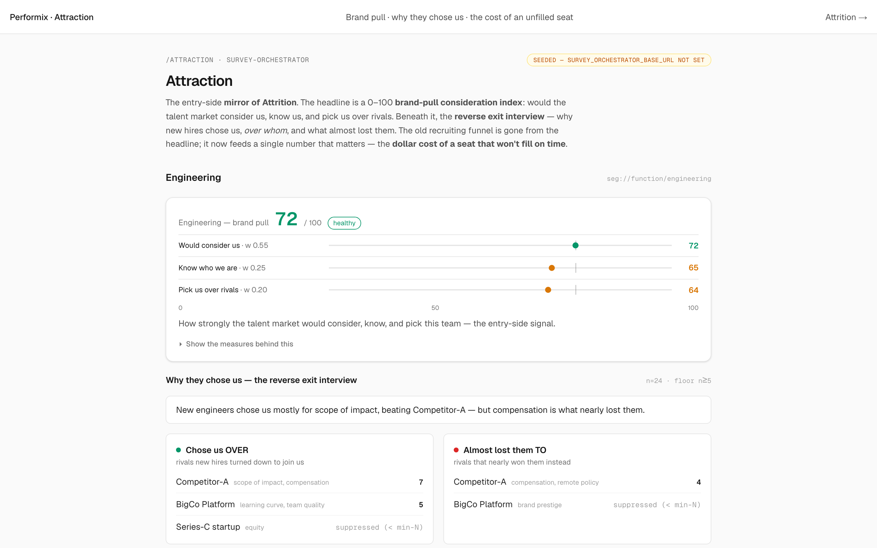
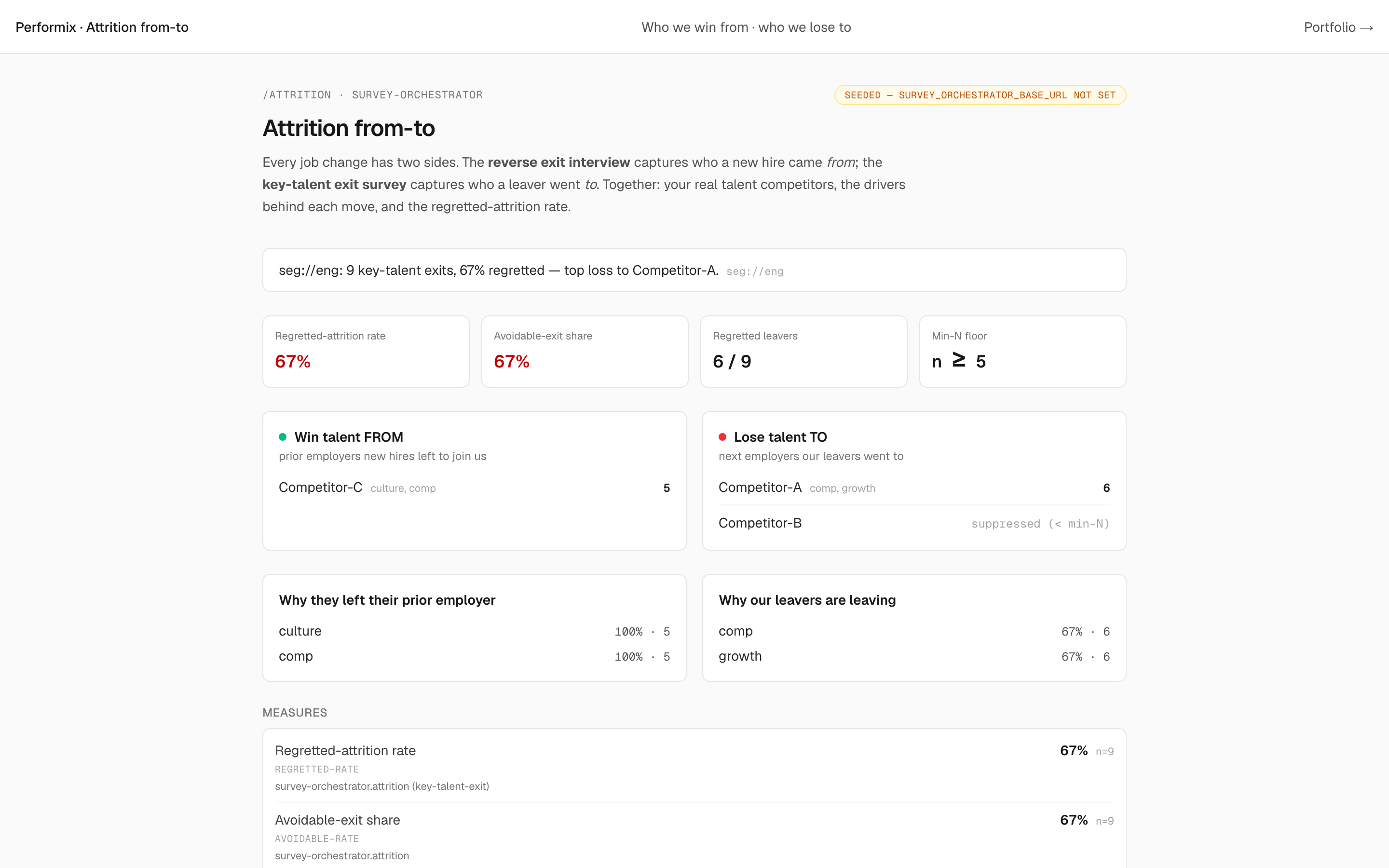
Attraction reads the select-in door as a brand-pull index plus a funnel, and asks departing-from-rivals new hires why they chose you — the entry-side mirror of an exit interview. Attrition reads the keep door as a from-to map: who you win talent from, who you lose it to, and how much of the loss you actually regret.
Each is a real surface, not a roadmap promise. Shown here on seeded demo data — the same honest “seeded example” posture the product uses until a customer's own data is connected.